

July 16, 2018
Have you ever come across a website that was so crowded with letters that it obstructed you from focusing on anything? You might have even wondered what compelled the creators to design such an interface.
I was faced with such questions as well when I first saw the mobile website for 10times.
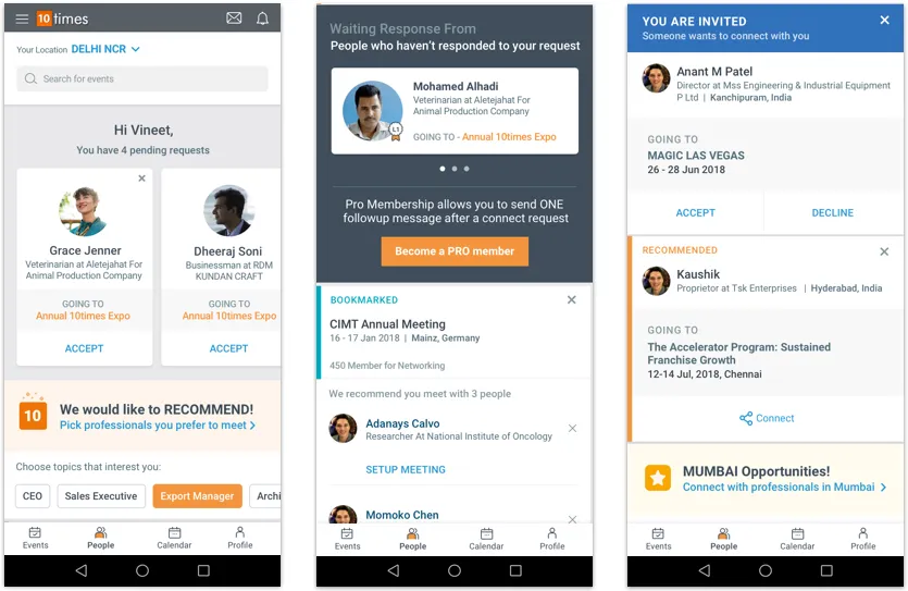
A little background, 10times is one of the world’s leading B2B event discovery and networking platform. It is a consumer product with a pretty niche target audience of only professionals. Being a B2B product, 10times followed something like this when it came to web design:
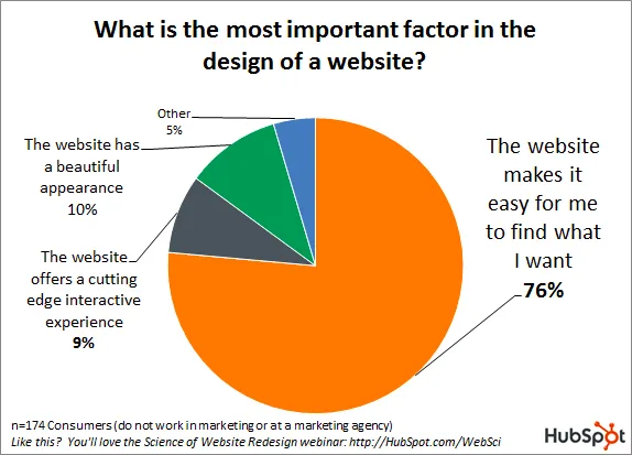
In order to satisfy 76% bracket, EVERY bit of information was upfront. With everything showcased, the website was bound to be overloaded with content (predominantly text).
Just like any social media platform, all the images on 10times are uploaded by their users. Unlike Facebook and Instagram, 10times users focus more on business advertising and marketing. Therefore, all the pictures were mainly logos and banners about events which sacrifice aesthetic appeal for maximum information.
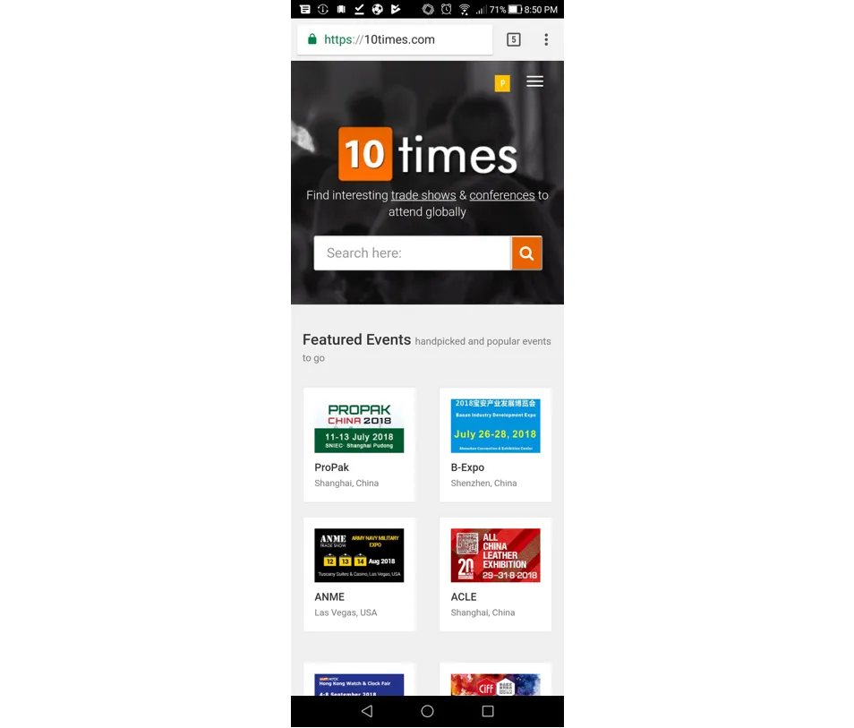
To summarise, the platform barely housed pictorial content and even if it did, the quality was pretty poor. Yet, I was tasked to make it visually appealing and reduce the visual clutter. Challenge Accepted!
With no images to break the visual mundanity of the layout, I turned to the one arsenal I could manipulate for the needed results; Typography.
Since my colour palette was limited to muted tones of greys (apart from the orange and blue), I emphasised important pieces of information using varied weights of Roboto. For example, you may want to highlight an important venue or date of an event. Using a medium or bold weight will give your words that extra emphasis without compromising on the type size.
Using both upper and lower cases in the UI. I used all caps for certain CTA’s that were more secondary in nature.
A word of caution when working with all caps; not to use it too heavily in the UI, unless you want SHOUTY CAPITALS. Not only can it make the design loud, uppercase is harder to read as compared to lowercase. Meaning it does not take kindly to long sentences.
Due to the limited sizes of the cards, I added varied leadings (the space between 2 lines) between headings, subheadings, body texts and so on.
When designing content heavy sites one mustn't forget designing for empty states. In my case, “empty states” meant lack of data. The solution I applied was designing adaptable cards that would modify depending on the data available.
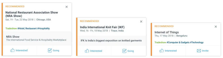
To avoid blank and empty patches, I designed cards that could transform their overall sizes as per the volume of text. Variable cards helped maintained the design consistency and much needed neatness.
Hi Everyone! I’m a UX designer at GDD currently based in Noida. I love exploring aspects of tech and design to create meaningful and utilitarian products.
Written By
Keep on Reading
October 12, 2017
July 10, 2017
.jpg)
April 5, 2024
Connect with us to discuss your ideas for the next big product.


.svg)