

May 2, 2025
When users wait for a payment to process, a search result to load, or a screen to respond, they enter a psychological limbo. That’s where doubt creeps in. Did it freeze? Did I tap the wrong button? Is my data stuck?
This is where the real work of UX begins. A loader isn’t just a decorative spinner - it’s a micro-interaction that builds emotional continuity and reinforces system feedback. It tells the user: “Something is happening. You’re not alone. You’re in control.”
According to the Doherty Threshold, productivity soars when human-computer interactions occur within 400 milliseconds. But when delays exceed that, users begin to feel the wait. That’s why designing meaningful feedback during these pauses is crucial. If the system can’t move faster, the experience must slow down gracefully.
Duolingo isn’t just fun, it’s fast. Lessons move at a brisk pace, keeping users in flow. When a loader appears, it’s not an interruption, it’s a beat in the rhythm. The dancing owl matches user momentum, reinforcing energy and reducing perceived delay. That’s not just UI animation; it’s emotional pacing.
UX Impact:

As a platform built around privacy and reliability, WhatsApp avoids flashy transitions. During tasks like chat backups or media transfers, the loaders are minimal but exact. They display progress, expected duration, and specific actions.
UX Impact:

We believe that how we design waiting is just as important as what users are waiting for. Here’s how we’ve applied this thinking across different projects:
We found the Havells Sync App lacked any loader, creating a gap in the experience. We explored loaders using elements from the Havells logo, simple shapes, pulsing gently to indicate life and continuity.
Our final direction embraced nostalgia with a Pacman-inspired loader, quirky, unexpected, yet perfectly aligned. Like Havells, Pacman is a legacy icon - instantly familiar, quietly comforting, and rooted in continuous motion. It wasn’t just a visual trick; it was a metaphor for progress. The chomping movement mirrored the app’s data sync process, turning idle time into a light-hearted journey. In a world of spinners, this retro touch added personality and presence transforming a pause into a playful micro-moment that users could actually enjoy.
UX Impact:
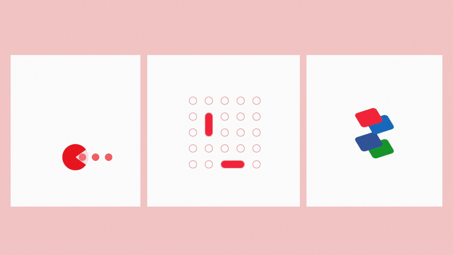

This wasn’t just brand alignment - it was a way to reflect stability during backend triggered delays. Users could sense that something purposeful was happening, even if the system needed a moment.
For the Havells Loyalty platform, we designed loaders that hinted at what’s to come, flipping coins falling into place. This wasn’t fluff; it was motivational UX. The loader was a visual metaphor for reward accumulation, subtly nudging users to stay the course.
UX Impact:
Case in Point: Stashfin
In fintech, uncertainty is risk. With Stashfin, we avoided playful metaphors and leaned into calming visuals - smooth gradients, steady animations, and loaders that reinforced progression during critical stages like KYC and credit checks.

One standout was a speedometer-style loader, mirroring the idea of credit building. It wasn’t just thematic; it was aspirational. It showed upward momentum, reminding users: “You’re making progress.”
UX Impact:
Let’s not treat loaders as last-minute patches. At GDD, we design them with intention, based on three core principles:
🧠 Psychological Safety: Use loaders to reduce ambiguity. Show that the system is working. Feedback is not optional, it’s UX oxygen.
🎭 Emotional Continuity: Make sure the tone of your loaders matches the product. If your app is playful, the loader should carry that energy. If it’s serious, let it breathe calm and confidence and sharpness.
🔁 Progress, Not Just Motion: Aim for meaningful motion. Can you hint at the task? Reflect effort? Reward patience? Don’t spin in circles, move forward with purpose.
✨In Summary: Let’s Design the Pause
As digital systems grow faster, more intelligent, and more dynamic, delays will remain and so will user doubt. The job of a loader is to translate system delay into emotional clarity. The best ones do more than fill time, they tell users: “You’re safe. You’re progressing. You matter.”
Let’s not just fill the gap. Let’s design it.
References:
📚 UX Principle Spotlight: The Doherty Threshold
This UX law states that system response times under 400ms keep users engaged—beyond that, perceived delays rise.
So when a delay must happen, designing the feedback becomes critical. Read more here:
🔗 Doherty Threshold on Laws of UX
📖 Also Recommended
Want to dive deeper into how loading states shape perception? Check this read: 🔗 How to Turn Boring Loading Screens into Engaging UX MomentsThere’s a curious tension in digital design between speed and slowness, between seamlessness and pause. In this in-between space, loading states often go underdesigned or overlooked. But tiny delays aren’t empty, they’re charged with emotion. They’re moments of uncertainty, anticipation, and potential frustration. A thoughtfully designed loader can shift that emotional tenor from doubt to reassurance.
Written By

Keep on Reading
August 4, 2025

July 16, 2018

June 24, 2017
Connect with us to discuss your ideas for the next big product.

.svg)