

August 27, 2024
In 2023, the Tata Group launched an ambitious project—TATA Neu, a super app designed to seamlessly connect users with their extensive range of brands. To bring this vision to life, Tata Digital embarked on a transformational journey, adding new design teams, visionary leaders, and dedicated researchers to its ranks. GDD's team was brought on board to design the Travel section, which included flights, hotels, and holiday packages. With a similar approach that was followed for the flights section - the Hotel journey promised an exciting adventure!

We started by understanding what travel really means in India.
To begin, we delved into what travel means to people in India. Drawing from our experience with other travel platforms, we approached the TATA Digital team with a set of initial questions. Through workshops, discussions, and various exercises, we explored different aspects of travel. While our design approach usually leans on logic, we were encouraged to adopt a more creative mindset for this project.

Guided by the spirit of exploration and fueled by the desire to redefine travel, a team of designers embarked on a quest to craft an experience like no other. As they gathered around the drawing board, a question echoed through the room: "What does Travel mean in the Indian context?"
In India, festivals play a significant role in everyone's life, and people spend a lot of time planning for these celebrations. Just like festivals, travel should be a rewarding and enjoyable experience from start to finish. The “Celebrate Like a Festival” theme embodies the essence of festive fun, using neon colors, evening tones, and geometric shapes inspired by the Art Deco movement to add a sense of modernity and luxury.

We divided users into three categories based on our research: Mr. & Mrs. Das (Couple Travelers), Ria Khanna (The Luxury Traveler), and the Sharma Family (Family Travelers). In addition to conducting a thorough competitor analysis and reviewing secondary research, we used insights from previous projects to shape user journeys. Our main focus was to identify ways to add value for customers and simplify the user flow. Navigating different perspectives and resolving conflicting opinions was challenging, but it led to growth and innovation. Through collaborative workshops, ideas were shared, debated, and refined, with the best ones selected through a democratic voting process. This collective effort gave rise to design themes like Travel Gullak, Travel Calendar, and Group Planning.

In addition to conducting a comprehensive competitor analysis and delving into secondary research to shape our strategy, we harnessed insights garnered from past endeavors to craft user journeys that formed the bedrock of our approach. Throughout this process, our primary focus was twofold: pinpointing avenues where we could enhance value for our customers and refining the user flow to ensure swiftness and simplicity. After finalizing the wireframes, we drew upon the previously established design themes to create moodboards. These moodboards served as visual inspiration, incorporating elements that resonated with the essence of travel.

We refined our ideas and translated them into concepts for the UI moodboard, aiming to capture the spirit of exploration and adventure. After several iterations, we found the perfect balance, ensuring that the UI design reflected the unique charm of the travel experience.

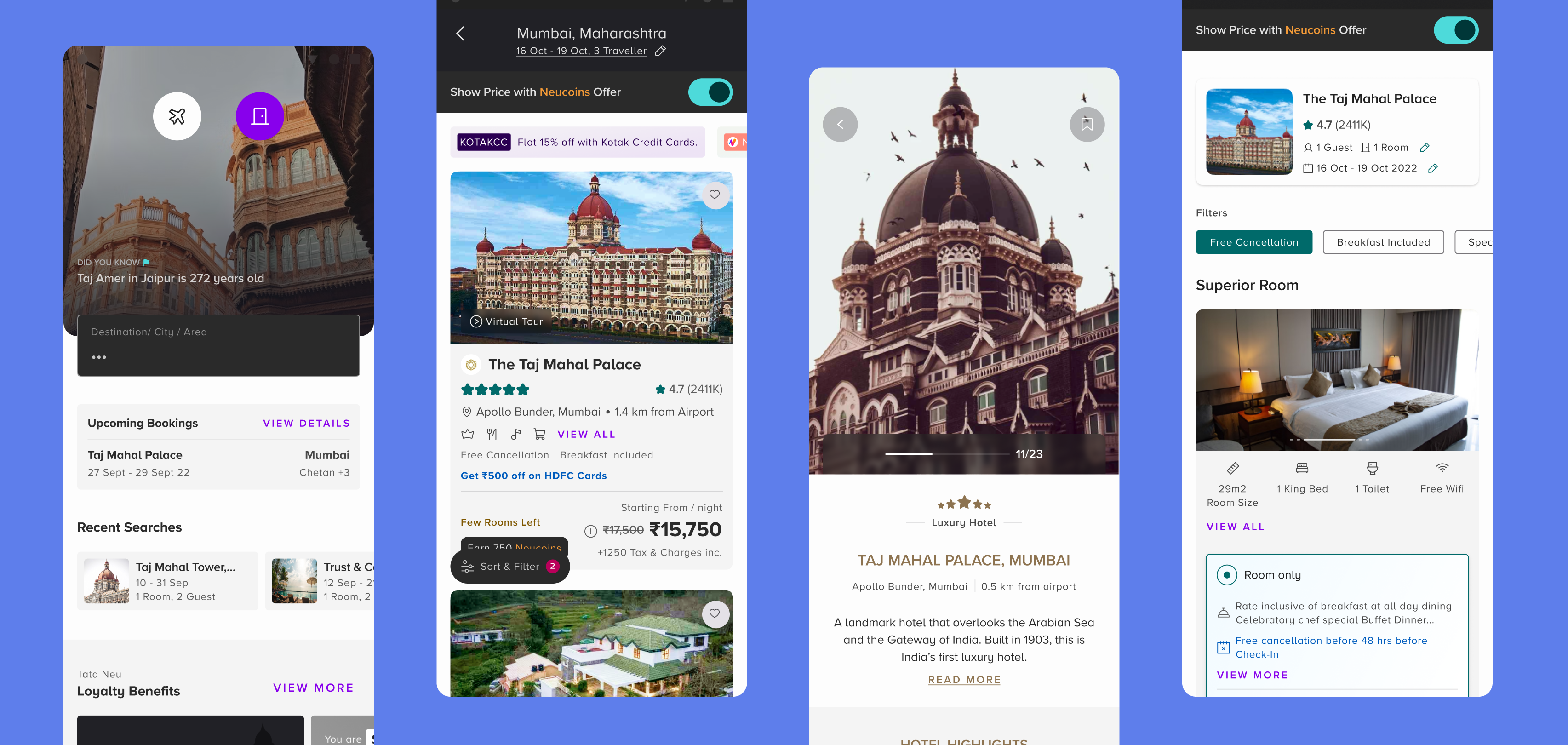
Our goal was to make the hotel search and booking process as quick, easy, and hassle-free as possible. The app offers a user-friendly interface, efficient search filters, and a seamless booking experience, ensuring that users can find and book their ideal hotel with minimal effort.
We carefully designed the hotel detail pages to present all necessary information clearly and attractively, ensuring users can easily find what they need to make informed booking decisions. Essential details such as the hotel name, address, contact information, star rating, and guest reviews are prominently displayed. High-quality images showcasing the hotel, rooms, amenities, and surroundings create a strong first impression. Detailed descriptions of room types, amenities, and pricing are provided to give users a complete understanding of their options. The booking process is straightforward, with transparent pricing and availability information, while relevant details about on-site amenities, dining options, and nearby attractions are readily accessible to enhance the overall experience.

We prominently displayed deals, discounts, and special packages to encourage bookings and enhance customer satisfaction.

As we refined the Tata Neu Hotel experience, our focus was on simplifying the hotel booking process while emphasizing the advantages of Neucoin and NeuPass. We designed the user flow to be intuitive and clear, ensuring a seamless experience from start to finish. Each screen, including hotel summaries and reviews, was carefully organized with a clear hierarchy of information to ensure users could easily find the details they needed without confusion. We avoided dark UX patterns, prioritizing a user-friendly interface that builds trust and confidence throughout the hotel booking journey.
In developing the Tata Neu Hotel section, our goal was to offer users a seamless, enjoyable, and rewarding experience, from booking hotels to discovering dining options. By focusing on ease of use, clarity, and a celebratory spirit, we crafted a hotel booking journey that feels as joyful and fulfilling as a festival.
Written By

Keep on Reading

January 31, 2024
.jpg)
December 19, 2023

March 19, 2018
Connect with us to discuss your ideas for the next big product.

.svg)